Table of Contents
I want to go through with you a short tutorial on how I created the style on one of my Google Sheets spreadsheets. I think Google Sheets is a wonderful tool to punch in data and display it in a meaningful and easy way. It provides us with a broad spectrum of capabilities and can sometimes be a little daunting.
The reason being that it can steer people away especially when you’ve created a Google spreadsheet that is difficult to read. You can imagine that some spreadsheets have thousands of data entries in them. And this can be rather overwhelming for the reader.
How do you make Google Sheets look good?
One thing you can do to improve the readability of your data is to make it look distinguishable and easy to read. Google Sheets allows you to customize your style in almost every aspect of the visuals. You can bold text, italicize, center the words, wrap words, and much more to make the data more enjoyable to look at.
But why do you want to do this? Google Sheets is just software that holds lots and lots of data right?
That is right. But it’s also so much more than that. It’s software that can turn truckloads of data into something you can use and benefit your life and your business. However, the more data we put into Google Sheets, the more difficult it becomes to decipher it into relevant and actionable data. This is why I propose that you should stylize your spreadsheet. Putting colors and dividing up the lines and bolding certain characters to make it easily readable for both you and the reader.
Don’t pay someone to do this for you. It’s extremely easy to do.
If you like what you see and you use Google Sheets a lot then this is definitely the right article for you. Continue reading because I’m going to show you exactly how I achieved this in no time at all. It’s actually very simple but there quite a bit of setting and customizations I had to perform to get to this point.
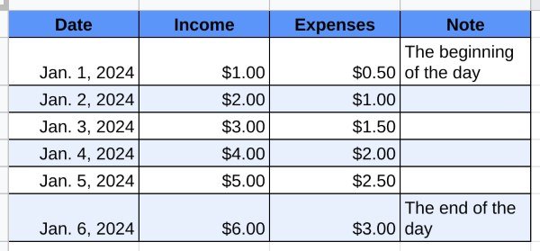
Google Sheets table stylized
The best thing about this is that you can mess around and experiment a little with the customizations that Google Sheets has available for you. Let’s dive in.
How to bold your the cells in Google Sheets
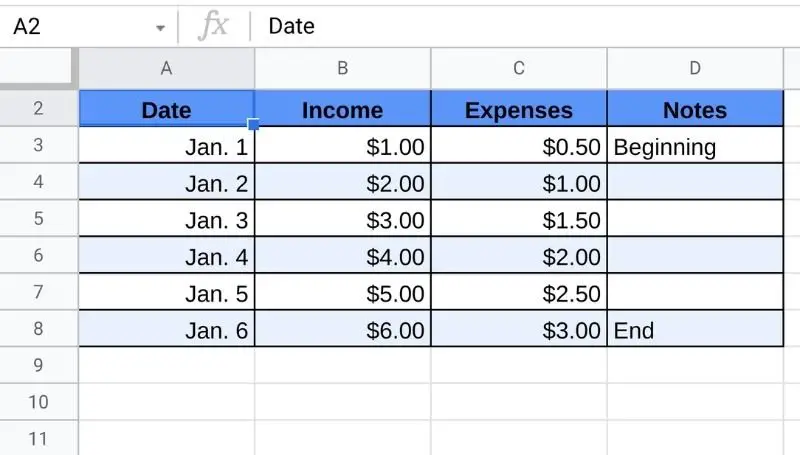
Now the first thing you’re going to want to do is bold the first line in all your columns. This is usually the row that holds all the titles in your spreadsheet. This is a row is labeled as the number one row. The idea is that we’re going to put all our data underneath this title row.
Now if your spreadsheet is much more complicated than mine, you can easily bold any of the rows you wish, at any level you want. You simply have to highlight those specific cell boxes.
Pay close attention to the example in the image snippet of my sample spreadsheet above. I’ve bolded the word date because everything underneath it is the date itself.
As you can see clearly that this is making my spreadsheet pretty easy to read. At least they will know that everything underneath the bolded word date are the dates. There won’t be any second guesses of what this column might be, it’s just clearly “dates” because that’s what listed underneath it.
The easiest way to do this is to simply highlight the cell box you plan to make bold. Then go right up to the large B icon above the program and click on it.
Here’s a pro-tip on making it really easy for you. In order to make sure that every cell in row 1 is bold, just highlighting the box that is to the left of the A1 cell. I’m referring to the left side panel of descending numbers. Go to the first row which has the number 1 in it and click on this box and this will highlight the entire row all the way to the very last cell that exists.
Next, simply go to your tabs above and again press on the large B icon.
How to center the text in your cells in Google Sheets
Making sure the texts are centered is a great way to distinguish your words from the rest of the data. Why does centering text help with readability? People’s perception of symmetry has a lot to do with why centering the text is often reserved for titles and labels. It’s the fact that both the left and right ends of the word are evenly spaced satisfies this obsessive-compulsive disorder.
So if you want to cure your OCD, then centering the titles or texts in your header is going to definitely help.
Start by highlighting the cells with which you want the text to be centered.
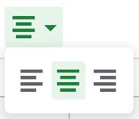
Next, you’re going to want to look for the alignment icon. It looks like 4 differently length horizontal lines conveniently called “horizontal align” if you were to hover your mouse over it. Once you’ve found it, there should be three different options. This option will force all your highlighted cells to align themselves into the center of the cell.
Doing so would greatly improve the readability of your headers and help differentiate the headers from the data.
How to simply color the background of a cell in Google Sheets
Next, let’s go ahead and color our cell headers. This pretty simple. It’s almost as simple as bolding our text, except that you have a ton of colors to choose from. Coloring the cell titles once again requires us to highlight the cell that you wish to have a new background color.
After highlighting that cell, or group of cells, we need to look above again at the tab icons where we’ll find the fill color tab. This tab is supposed to look like a paint bucket that’s tipped over with a drop falling from the corner.
Aside from the looks, if you click on this icon it will open up an assortment of color selections. You can pick anything from solid colors to your own custom hex colors. There are even a few extra options for conditional formatting which is allowing Google Sheets what you want automatically colored. And another option would be to alternate colors which allows you to select a group of cells and improve the visibility of the data by alternating the colors after each and every row. More on this in the next header.
This means that it will fill whatever color you choose throughout the background of the cell.
How to create alternating rows of color in your Google Sheets cells
An incredibly handy tool found in Google Sheets is the ability to automatically set alternating rows of colors in your sheets. To do this is simple. You need to go to your Fill color icon drop-down menu and look for the Alternating colors option which is usually found at the bottom.
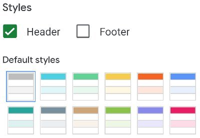
Once you click on alternating colors, you’ll see all the different default styles that Google Sheets already has premade for you if you so chose to use them. You can even customize the colors and the header of your Google Sheets. You can create any combination you like and I welcome you to do so according to the theme you want to use. However, I find the default ones to suffice and to be the most eye-pleasing template of stylizing for your Google Sheets.
Once you’ve made all your color selections, just click on Done and it will automatically fill the alternating colors and the headers with the colors you have previously chosen.
Keep in mind, if you have a blank Google Sheets, the alternating colors will not appear until you have something written into that particular cell. As you continue to use more lines and rows, the alternating colors will grow to those lengths and alternate the colors of those cells as well.
How to outline the border for your table of data in Google Sheets
Now that you’ve gotten this far, you’re going to want to make some definitive outlines for your table of data. What I mean by outlines is the lines will show up deeper and darker around your table creating a border effect and enclosing your data within it.
This is something that will help the reader including yourself easily read and differentiate between different cells. With these borders, you can easily read through the data and differentiate between different cells or similarly related cells. It’s very important to make sure that you don’t get confused or mix one cell that doesn’t correlate or max with data in another cell when you or someone attempts to read across the rows and columns.
In order to do this, make sure you highlight your entire table. This table should include all your data but no extra empty spaces unless you intend on adding more in the future. With your mouse, click and drag from the very top left corner of the table all the way down to the very bottom right. You can continue highlighting even more than just the data occupied cells. You can highlight empty cells that you believe you will need in the near future. Or you can come back later and expand the borders out even further. The choice is yours.
Now once everything is highlighted, you’re going to want to look up at the top icon bar in the program again and click on the icon called Borders.
The border icon simply looks like 4 boxes stacked up as 2 by 2. Hover your mouse over it and it should say border.
The borders icon has many different options on specifically what types of borders you can make that are visible. For example, you can leave the insides of the table borderless and just have borders on the outside of the table. You can also make borders only visible on the left corner or the right corner of your table which doesn’t seem like something someone would ever need to do. But it’s there and you can do it. You can also do that same thing with the top and bottom as well. No need to worry about the options because it covers almost every option you can thing of when creating borders.
One thing I would like to add to the mix is that you can change the color of the border as well and you can even try your luck at changing the style of the border. Changing the color is obvious but changing the style of the border makes the border means changing the design of the lines itself. You can have dotted lines or lengthy lines with gaps between each dash.
These lines can also be customized to be thicker or thinner as you choose.
How to make sure your words are not cut off in your Google Sheets cell
You know when you have several lines of sentences or a really long line inside a single cell, and you noticed that it gets cut off at the end of the cell because it’s just too long and it won’t fit properly in the cell?
There’s a solution to that if you want to make Google Sheets wrap you words around and make your cells bigger so that all your writing and data would be visible.
In order to do this, you’re going to need to highlight the cell or groups of cells you wish to make visible the entire data no matter how long it is. Keep in mind though that even if you highlight just the entire table, the row before and after that table will be just as big when the cells inside the table are resized to fit all the characters. That’s probably going to be something you’ll notice immediately. You will have extra space for cells in the same row and the size of the cell is only as large as the cell with the most information packed in it.
Now go up to the top icon in all the menus above and look for an icon called Text wrapping.
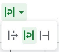
Here you will see three options, the first option is called Overflow and it will allow your actual value inside the cell to stay on the left side of the cell. If there’s more data in that cell than the cell can fit, the cell doesn’t change but the data continues to be visible even pass the cell it occupies. It doesn’t affect the next cell though. It is only visible and does nothing else. The third option is called Clip and all it does is cut off the rest of the data if it happens to be longer than the end of the cell. Finally, the middle option is called wrap and it is used to “wrap” text back to the bottom if there’s too much. It will expand the cell as much as it can to make sure all the words we write in that cell will fit it. Click on Wrap and you’ll notice the changes occur immediately.
Conclusion
So far I would say that is important to make sure that your spreadsheet is distinguishable, legible, and readable. Oftentimes this requires that you stylize your spreadsheets to make them more eye-pleasing. It will make things much easier for you and anyone who needs to look at the spreadsheet to analyze that data.
You should make your priority when it comes to stylization on readability. It can be very difficult if someone were to look at lots and lots of data without stylization.
