Table of Contents
Reading documents can sometimes be really boring. But you and I both know that it’s the duty of the writer to grab the reader’s eyes. I want to show you a fantastic way to spruce up your article and captivate the reader’s attention.
Sometimes what we need to include in a document is a really good title. And sometimes even that’s not enough.
In order to grab someone’s attention, we need to understand the reader on a psychological level. How long should our title be? How should we word it? What kinds of words should we use?
There are probably a dozen more things to consider. However, I’ve got you covered for at least one thing here. I was introduced to Word Art years ago back in school. It used to be a big deal. And just so you know, I found it really effective in capturing people’s attention.
So does Word Art still work to grab the attention of a reader? There may not be a definite answer to that, however, there’s a very strong correlation to the amount of attention a product will receive if the title or header of the product information has a design that is often easy to read and visually unique and colorful.
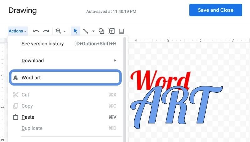
How to Insert Word Art using Google Docs
- Open or create a new Google Docs document
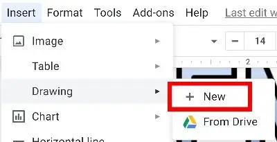
- Go to the Insert tab at the top.
- Click on Drawing.
- Then New.

- Click on the Actions tab.
- Then Word Art.
- Type in the words you wish to stylize.
- Press Enter.
You’re not done yet. You still haven’t stylized your Word Art yet. This is where you can let your imagination run free and design your Word Art in almost any way you can imagine. Let me show you what you can do with this text now. Continue on below.
You will need to stylize your Word Art in Google Docs
So what you’ve accomplished so far is actually converting your keywords into word art. It’s just a bunch of characters anymore. You can now modify outline size, transparency in the middle, and even resize the Word Art. You can even create a gradient color. As I said, the fun part is the stylization of the word art.
The current Word Art in front of your screen is probably a blown up, pretty boring outline of the characters. What you want to do is stylize this font. You’ll find that while you’ve highlighted the Word Art you’ve just created, a set of icons on the top of the window will become visible and available for you.
Now before you hit Save and Close, you’re gonna want to consider the following.
Picking the Perfect Font for your Word Art
This is where the real fun begins. Or at least I found it to be the most enjoyable.
Head over to the top labeled as Font. By default, it’s Arial. But if you click on it, you’ll notice a really long drop-down list. From here, you can change it to so many different fonts simply by searching through this drop-down menu. When you’ve decided, you can click on that font and it will automatically change your Word Art. You can even add more font styles if you click on More fonts from the very top list in the drop-down menu. There are a ton to choose from.
Here’s a little advice on picking a suitable Word Art font that would work in highlighting what you’re trying to portray. Choose a font that is easy to read. I found that this can sometimes exclude fonts in cursive. The cursive font works well if you’re wanting to display a hip and fashionable style of the headline, but it can also detract from the viewers’ attention because depending on how curvy this font is, they might spend a little more time than they want to try to decipher these words.
When a view is trying to decipher characters or content, there’s a likely increased chance that this person might give up and move onto something else.
Select fonts that are large and clear. Nothing should be too spaced out or too bolded. Nor should it be too thin and compacted together.
After I’m done picking and choosing the font, I like to step back a bit from my display and look at every letter for just a few seconds think to myself, is this something I would find easy to read?
Coloring the lines and insides of your Word Art
Right above the checkered layout within your Drawing window, you’ll see a list of icons. Hover over the one that says Fill color. The icon is supposed to be a bucket of paint tipped over with a drop of paint dripping from the bucket. It honestly just looks like someone just drew a 4 sided diamond and shaded the bottom half. In either case, this is called the Fill color icon.
Here, you can pick and choose almost any color you like your words to be. Notice however that whatever color you choose, it will only change the color of the inside of your words. Not the outline.
Within the Fill color picker, you have an array of other options. The colored bar at the bottom of the icon indicates the color you currently have it set to. It’s just an indicator for your convenience. You can look up to it anytime you wish to see what color it is you’re actually applying the item to or whatever color the item is currently set as.
Here, you can change the transparency of the fill color, or you can create custom fill colors including custom gradients. Ingredients are when you see the difference is as you move across a color. You can make it to where at one point of the word it is green and as you move further to the other side of the word, it begins to look more purplish.
You may decide that you want to change the color of the outline as well. I’m referring to the part of the word art that is not the middle. It is the part that lines the letters and the words themselves. In order to do this, there is an icon above labeled Border color. The icon here looks much more like a pen and is usually located right next to the fill color icon. Border color allows you to change the color of that outline that lines the words.
You also have options that are similar to fill color minus the gradient option.
Change the border sizes of the outline in your Word Art
Next, you can also change the thickness of the outline of the Word Art. Sometimes you might hear it being called the borderline but it’s practically the same.
In order to do this, you’ll need to click on the icon that says Border weight. This icon can be described as a thick line at the top, and then a medium-sized line in the middle, and underneath that is a very thin line.
Border weight allows you to thicken or make thin those borders that outline the Word Art. What’s the difference between increasing border weight and simply bolding the font? Border weight actually makes the outline itself either thicker or thinner. When you click on bold, the area inside the outline is thickened. Nothing happens to the outline. The outline keeps its thickness. It’s the same area that refers to the fill area that gets bigger. This is the exact same area that the fill color icon alters.
You can change the actual design of the outline that borders around Word Art
If you really want to experiment a little, you can alter the borderlines or outlines even further by changing their style. Border dash gives you the ability to change whether the borderlines are solid, dashes, or even dotted. There are just about 6 different patterns you can choose from some of which almost reminds me of morse code.
I didn’t really find this option too appealing. I made a few changes to my word art changing the Border dash but this just seemed to make the art and the character is a little bit more annoying to look at. I really don’t think this would be a very good option to change at all. Anything other than the default just seems too unprofessional and unnecessary.
In order to grab the reader’s attention, you might want to just keep this option as a solid line.
Bold and Italicize the Word Art
This is simple. You’ll find the Bold and Italic button above as well. Bolding and italicizing are necessary when you make it to take your point across to an audience.
Since this is Word Art and the word itself is blown up, you might not need to bold it. But if you’re curious, take a look at what would happen if you press the bulb button. As I stated above, pressing bold will make the field area thicker. It won’t do anything to the outline itself. So if you choose a font that is really skinny, this may be the best option to get it blown up a little.
For italic, if you’ve fallen in love with a font already, but you want to change the font style up a little, you can use italic to further alter and make it sway to the side a little. Again this is a stylization that works differently for different fonts. Depending on what type of font you are using and under the context of what you are using it for, it may either be necessary or unnecessary to use italicization. I found that for cursive font there is no need for italicization.
You can move your Word Art around, resize and stretch it with your mouse
In Google Docs, you have the option to modify your word art even further using your mouse or trackpad. In order to do this when you click on your Word Art you will notice that there are several circles at the corners and the sides of your highlighted word art. Those boxes allow you to move the word art, reshape the word art, and even stretch out the word art from the top or from the sides.
Rotate and Flip your Word Art on Google Docs
This trick is a little hidden and not used much. But if you want to either rotate or flip your Word Art:
- Make sure your Word Art is highlighted
- Right-click the Word Art with your mouse, or 2-finger click the Word Art on your trackpad
- Hover over Rotate
Here you’ll find options to rotate limited to 90-degree increments and flipping the Word Art either horizontally or vertically
You can make multiple Word Arts on the same drawing window
Can you make more than one Word Art on the same window? The answer is yes. All you need to do is click again on Actions > Word art. This will simply create yet another word part for you to modify that is separate from the one you created before.
Now you might be wondering why would you want to create more than one Word Art? Maybe you want different fonts. Maybe you want to emphasize a different word. All of these are valid reasons and may actually help improve your attention-grabbing headline. If you ever have the chance, go ahead and change the font on the last words or a particularly important word in the middle.
By the way, I found it best that if you wanted to make inferences on a word in the middle then you should go ahead and create a total of three different Word Arts. The first one would be simply the beginning of your topic headline. Then follow it up with the emphasized word using a different font and maybe bolding that word. Then finally, simply go back to the first Word Art and copy and paste it so that you have the same exact font and color. Simply just changed the words to reflect the ending of your topic.
Issues You Might Run Into
While pretty straight forward, I’ve noticed a few issues I encountered when trying to create Word Art.
You need an internet connection to use Word Art
Make sure you are connected to the internet. I noticed that as my signal dropped, the dropdown option Draw faded out. I wasn’t able to click on Draw until I reestablished a connection. Traditionally, Google Docs will allow you to continue writing your document even offline but apparently, that doesn’t apply to Word Art.
You need to highlight the Word Art in order to make any stylization to it
This may sound very basic, but it’s a problem that a lot of people really do run into. They’ll look up after initially creating there were dark, and then noticed that they cannot make any stylization because none of the icons show up.
If you don’t see the options to change the font or stylize the Word Art, it’s most likely because you need to first highlight the Word Art itself before making any changes. It’s something I’ve noticed when I was multitasking on a separate window and coming back to this document. Just make sure your Word-Art has that rectangular border around it.
This is a problem that can arise especially if you have more than one Word Art on the same drawing.
